Client: Portuguese Surf Film Festival
surffilm.squarespace.com
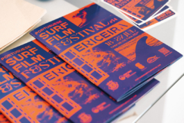
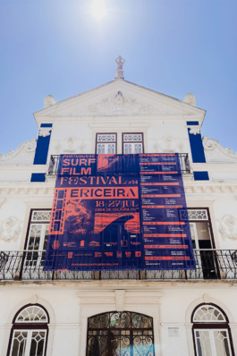
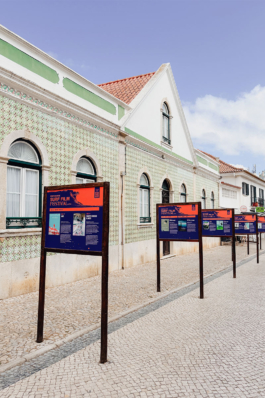
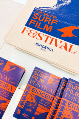
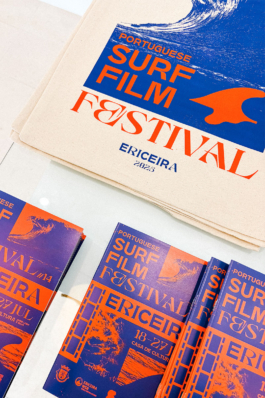
A cinematic colour palette and a playful, adaptable design system set the tone for the Portuguese Surf Film Festival.
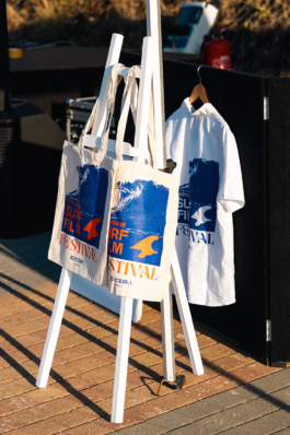
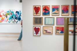
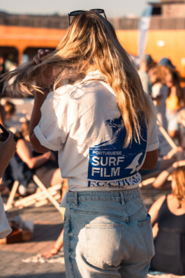
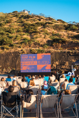
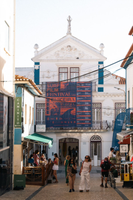
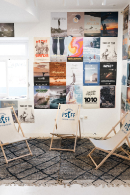
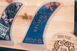
Built around just two colours inspired by Ericeira, the identity combines stylised imagery, icons, grain and film-like treatments to create a distinctive visual language. The flexible layout system allows these elements to be rearranged across very different formats, from posters and programmes to signage and merchandise, while always remaining recognisable.


Client: Portuguese Surf Film Festival
surffilm.squarespace.com
A cinematic colour palette and a playful, adaptable design system set the tone for the Portuguese Surf Film Festival.
Built around just two colours inspired by Ericeira, the identity combines stylised imagery, icons, grain and film-like treatments to create a distinctive visual language. The flexible layout system allows these elements to be rearranged across very different formats, from posters and programmes to signage and merchandise, while always remaining recognisable.


Have a project in mind?
↑
Have a project in mind?
I’m always happy to hear about new ideas and collaborations – big, small or somewhere in between.
Phone: +49 (0)151 230 424 04
Email: post@katharinagodbersen.de
↑