Client: Sylt Marketing GmbH
sylt.de
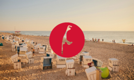
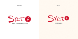
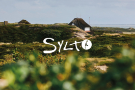
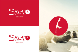
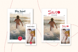
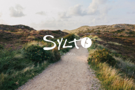
A subtle refinement of the iconic Sylt logo, preserving its familiar identity while carefully evolving its visual language. Rather than reinventing the brand, the redesign focused on harmonising the typography, simplifying the island silhouette, and integrating the circular element into the wordmark. These subtle adjustments create a calmer, more balanced appearance that feels contemporary while remaining unmistakably Sylt.


Client: Sylt Marketing GmbH
sylt.de
A subtle refinement of the iconic Sylt logo, preserving its familiar identity while carefully evolving its visual language. Rather than reinventing the brand, the redesign focused on harmonising the typography, simplifying the island silhouette, and integrating the circular element into the wordmark. These subtle adjustments create a calmer, more balanced appearance that feels contemporary while remaining unmistakably Sylt.


↑
Have a project in mind?
Phone: +49 (0)151 230 424 04
Email: post@katharinagodbersen.de
↑