Client: Cycling Paradise
cycling-paradise.com
Cycling Paradise brings the spirit of vintage cycling to the island of Sylt.
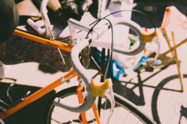
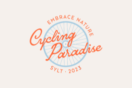
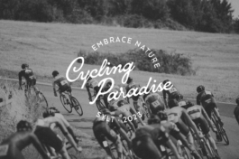
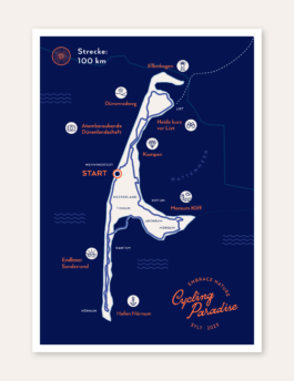
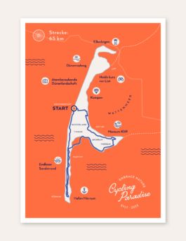
The identity takes its cues from classic cycling culture, combining a vintage-inspired colour palette and typography with a custom illustrated key visual. The main challenge was adapting the key visual across very different formats while keeping the overall look consistent. A flexible layout approach made it possible to scale, crop and rearrange the design across posters, signage, merchandise and event materials without losing its character.


Client: Cycling Paradise
cycling-paradise.com
Cycling Paradise brings the spirit of vintage cycling to the island of Sylt.
The identity takes its cues from classic cycling culture, combining a vintage-inspired colour palette and typography with a custom illustrated key visual. The main challenge was adapting the key visual across very different formats while keeping the overall look consistent. A flexible layout approach made it possible to scale, crop and rearrange the design across posters, signage, merchandise and event materials without losing its character.


Have a project in mind?
↑
Have a project in mind?
I’m always happy to hear about new ideas and collaborations – big, small or somewhere in between.
Phone: +49 (0)151 230 424 04
Email: post@katharinagodbersen.de
↑